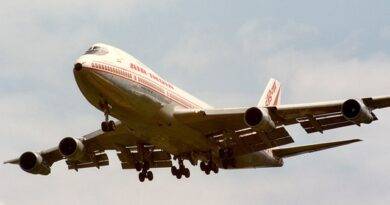
Analyzing Airline Logos
We are going to cover some popular airline companies with their logos. Think about a brand and close your eyes, if you see the logo of that brand than it means a success for that company and advertisers, designers/creators. And think about what emotions and feelings that the logo awakens on you?
Firstly, let’s start with a brief information about what is a logo? and What are the principles of a logo?
What is a logo?
A logo is a symbol made up of text and/or images that identifies a business. A good logo shows or evokes what a company does and what are the brand values.
Logo design is all about creating the perfect visual brand mark for a company. Depending on the type, a logo usually consists of a symbol or brand mark and a logotype, along with a tagline.
The underlined word type is the key. Type of the company is the start point of design process. Let’s think about airline companies. What are the main objectives and aims of these companies? Quality? Speed? Safety? Origins?…
Now let’s have a look to the principles of making a logo.
All the aim is to build and create an image which serves to the companies’ goals and objectives. There some principles that help to designers and creators on the process. According to Adîr et al. (2012), a logo must be:
- Legible – a very good writing;
- Coherent – clear, easy to be understood;
- Adaptable – to be designed in horizontal and vertical formats, in any size;
- Reproducible – easy to be copied, black and white or colored;
- Memorable – never forget it;
- Timeless – means a test to survive in time;
- Simple – to be easy recognized.
And same research pinpoints to a very useful topic. Geometric shapes and their suggestive inductions.
Table 1. Suggestive Induction of the Shape in a Logo Design
| Geometric shape | Suggestive induction |
| Circle | Perfection, Balance |
| Square | Stability, Power |
| Rectangle | Duration, Progress |
| Ellipse | Continue searching |
| Triangle | Harmony, Urge towards |
| Spiral | Advancement, Detaching |
| Sphere | Perfection, Finality |
| Pyramid | Integration, Convergence |
| Cube | Stability, Integrity |
Now let’s look at some of the logos of airline companies.

Circle – Perfection and Balance, Maple Leaf – Origin …
(Maple Leaf is one of the symbols of Canada)

Crown – Origin, Memorable, Timeless… (KLM is Royal Dutch Airlines)
Circle – Perfection and Balance, Crane flies eagle on logo – speed, strength…

Plum Blossom flower (one of the symbolic image of China) – Origin
Pegasus (Mythologica horse that can fly) – strength, speed, Orange tail part – speed …
As you see airline company logos are designed over same themes which serves to build a strong customer impression according to company values. Here are some more logos down here.





Adîr, G., Adîr, V., and Pascu, N.E. (2012). Logo design and the corporate identity. Procedia – Social and Behavioral Sciences. 51: 650 – 654.
for more articles click.


